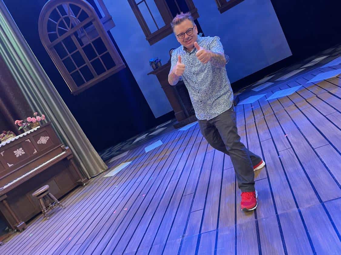
Jeff Brown is both the Scenic Designer and the Lighting Designer for Little Women, onstage at the Paramount for three more performances this weekend. We sat down with Jeff to talk about his design process, his work with BrownKnows Design (a Duluth-based company that designs and fabricates exhibits for museums), and of course, Little Women.
Talk us through your design process for Little Women.
Well the set design starts collaboratively. Working with the Director, we decide what the story we’re trying to tell is, and then how the set can serve that. What are the key themes we want to see onstage? What do we need to tell this story? And to create different locations? Once we know what we need to tell the story, we can figure out how to infuse that with visual interest. I want things to look cool! But it has to look cool and serve the story.
What parts of the story did you focus on making “look cool” for Little Women?
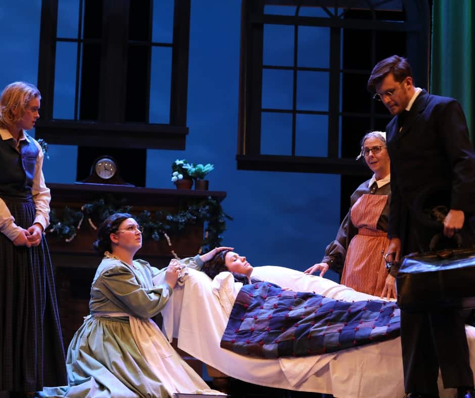
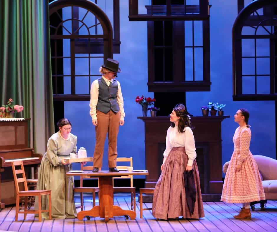
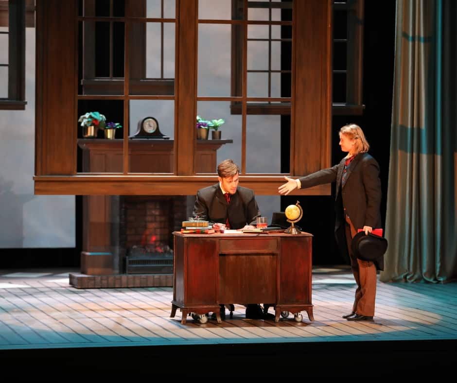
Well, there’s a few things I wanted to express with this set. One, it has influences of a memory play. Jo is remembering and telling this story, so what would Jo March remember? Memories are usually fragmented. Some aspects of our memory are really vivid, but not everything. Of course Jo would remember the piano, and the fireplace, and obviously the writing desk, but the rest is maybe more vague. The curtains lend to that feeling of etherealness. We also took pages of the actual book Little Women and scattered them across the floor, and the idea is that the pages of Jo’s book lead us to these specific memories.
Two, the play has multiple locations. I didn’t want to make a boxy set with four walls to carry on and off though, because that feels static. Instead, the curtains move to represent different locations. There’s a certain way they’re set up when you’re in the March’s home, and when you’re in Laurie’s home, and Mrs. Mingott’s. We can move the curtains to tell the audience we’re somewhere new without carrying walls on and off. And part of that is seeing the actors change the curtains, instead of going to a blue-out between scenes. When the actors move the curtains, it’s dynamic, it’s activity, the audience gets a sense that time is passing, and it feels like a true transition. Of course, changing the lights has a similar effect.
What is it like to design the set and lights for a production?
Awesome. I feel like I have a strong background in Scenic Design, and a very strong background in Lighting Design. So when I’m doing both, it helps me to think holistically about the design. As I work on the design of one, I’m considering the other and thinking, how can these designs enhance each other? Of course, it’s also double the work. During tech week, I’m answering questions and making decisions for both Scenic and Lighting Design, which takes a lot more mental capacity than just focusing on one. Same with watching rehearsals during tech week– I’m trying to take double the notes, and I can only write with one hand at a time!
How have you managed to keep the two roles balanced and not get overwhelmed?
I structure my time a lot when I arrive at the Paramount. I have to decide at the onset what I’m focusing on, whether that’s scenic or light, and I focus for hours at a time. I close out my phone, close the laptop, and get in the zone. Focusing on just one is tough when they’re so intermingled, though. Another thing about being both Lighting and Scenic Designer is, I’m not very likely to tell myself no when I have an idea. I’m more comfortable pushing myself than I might be pushing someone else. An example of that is, I knew early on that I wanted the moving curtains to be illuminated all the way to the top, to give the audience a sense of the height of the space. Since I’m the Lighting Designer, I know that I’ll do what I can to light those and to create dimensionality when they’re moving too.
Little Women uses fabric as part of the set in a way that GREAT hasn’t done for any other shows… How/why did you decide to incorporate the curtains?
I recently did Into the Woods, and when I was lighting the back wall I noticed that light bounced off it and hit this canvas fabric from behind. So I had unexpected backlighting on this hanging canvas and another light shining on it from the front. There was a dimensionality to it that I completely didn’t expect. Happy accidents happen all the time, and they’re awesome. That happy accident inspired a whole different design approach for the show, and then going into this project I knew it would be perfect for the liminal memory aspect of the story. So the curtains and their lighting is an idea I had working on Into the Woods, and it was a happy accident, or a discovery. And I think those are the little nuggets that you work for as an artist. They hopefully inspire us as artists to move forward and elevate our art, to incorporate cool ideas earlier in the process next time and see what happy accidents emerge from that and elevate things further. And I always want to learn.
You also design and fabricate exhibits for museums– how does that translate into designing sets and lights for theatre spaces?
Well, it’s actually reversed. I would say that theatre informs museum design, not the other way around. I’ve been in theatre for thirty plus years, around there. So my background is in theatre. The last nine years, I’ve been doing museum work with my own company, BrownKnows Design, and what I learned in theatre, I brought to the world of museums. We’re up in Duluth with five employees, and everybody who works with me has some theatre background– as actors, designers, technicians, or some combination, they’re all familiar with theatre spaces. That means they’re used to thinking about an environment holistically, and they know that an experience begins the moment you walk in.
Last question– what has it been like working with GREAT?
Well, how I started working with GREAT was through a referral from another Lighting Designer, Grant E. Merges, who GREAT works with a good deal. I worked on Langston Hughes’ Black Nativity, and I found that I really liked working with the staff at GREAT. I met with the Artistic Director, Kendra, and the creative team for Black Nativity, and I found them inspiring. I really liked working with them because they made me excited to be in the space, and I looked forward to working with them again right away.
We look forward to working with Jeff again too, when he’ll be Scenic and Lighting Designer for Footloose in the spring! Come and see Jeff’s work this weekend at Little Women!


